# CSS pseudo-elements: `before` and `after`
My first job was at a firm that created custom websites.
They mostly looked awesome and were CSS-heavy. I was an hour into my first day when I already encountered a `::before` - something a junior rarely uses at home when learning and it's hard to grip at if no one explains it to you.
Few weeks passed with copy-pasting the `::before` CSS from other projects, but then I got it and it wasn't that difficult to use.
But copy-pasting something you don't understand is never a good idea. That's
why I gathered most of the information about `::before` and `::after` in this blog.
So you won't be in a position of copy-pasting without understanding as I was doing it
and because `::before` is pretty awesome when you got to know it.
There are endless possibilities for creation with it when you're comfortable using it.
## What will I learn
At first, we will review the pseudo-elements, the difference between `before` and `after`.
The main property of a `before`/`after` selector is a `content`. There are many possibilities for its value and in the second part of this blog, we will review some of them:
1. a string
1. an attribute
1. an image
1. nothing
For each value, I provided at least one showcase that should give you a fair picture of what's going on.
This is not a tutorial, showcases are not explained in depth.
I suggest you copy-paste (or, even better, retype) each of the showcases and play with it a little, it will help you to understand those two `pseudo-elements` better.
## Prerequisites
1. Basic knowledge of HTML
1. Basic knowledge of CSS
## Pseudo-elements
Pseudo-element is an element that doesn't exist in the document tree but appears on the page as it would.
To simplify - pseudo-element (like `::before`) is a 'faker' that pretends to be there, but it isn't.
`::before` and `::after` leaves your markup semantic, but at the same time they give you a lot of extra design possibilities.
Think of them as two extra tickets to add cosmetic content to an element.
> Besides `::before` and `::after`, other pseudo-elements are: `::first-letter`, `::first-line` and `::selection`.
> They behave a little differently though because you aren't creating new content.
> Rather, you're selecting only a part of a tag, it's like creating a non-existing `span`.
You might expect them to be before or after the element, but that's not the case.
Pseudo-element is the first child of the selected element. That means they appear inside the element, next to its content.
They have few negative sides though:
- you can’t attach an event only to a pseudo-element
- most screen readers read the content of a pseudo-element ([here](https://www.stefanjudis.com/today-i-learned/css-content-accepts-alternative-text/) is a solution for that, but it doesn't work on most browsers)
- you usually can't select it
> You can't create `::before` or `::after` on the self-closing tags. So ``, `` or `` can't
> have `::before`!
Here's how that looks in practice:
**HTML**
``` html
Text in "myelement".
```
**CSS**
``` css
.myelement {
color: red;
}
.myelement::before {
content: "I'm before";
}
```
**Browser**
**Page source**
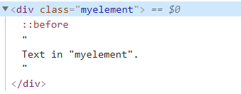
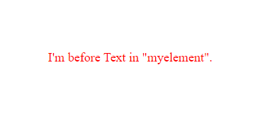
As you see, both texts are visible in the browser. But the `::before` text isn't visible in the page source.
Also, we set the color to red on `.myelement` and `::before` inherited it.
## ::before or ::after?
`::before` and `::after` behave very similar.
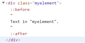
The only difference is how they position themselves in the browser and the page source.
**Page source**
`::before` appears before the content of the child and `::after` appears after it.
They are both **inside** the element.
**Browser**
If we don't manipulate their position, naturally `::before` comes *before* the element's content
and `::after` comes *after* it.
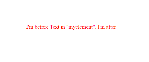
You can choose between those two based on where are you trying to put the additional element, but it's not necessary.
**FontAwesome icon `::before` the element**
**FontAwesome icon `::after` the element**
> Since `::before` and `::after` are pretty much the same, I'm going to use only the `::before` for the rest of the tutorial. Whatever I write for the `::before` goes the same for the `::after` too!
### Stacked
However, if `::before` and `::after` are stacked on top of each other, the `::after` will be positioned on the top of `before`.
If we create two squares of different colors and sizes and position them on top of each other, the `::after` square (blue) will cover part of the `::before` square (orange).
That's because the `after` is later in source-order.
**CSS**
``` css
.myelement::before {
content: "";
width: 50px;
height: 50px;
background-color: orange;
position: absolute;
left: 0;
}
.myelement::after {
content: "";
width: 30px;
height: 30px;
background-color: blue;
position: absolute;
left: 0;
}
```
**Browser**
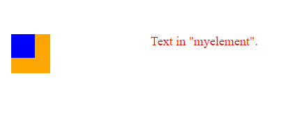
As you can see, the orange `::before` square is partly covered by the blue `::after` square.
> For now, don't fuss if you don't know what is going on, we'll cover that later on.
>This is just to show you the difference between `::before` and `::after`
## :before or ::before?
At first, there was **`:before`**.
Later, they distinguished between pseudo elements and pseudo selectors (eg. `:first-child).
- **pseudo-elements** have **double-colon** selectors(`::`)
- **pseudo-selectors** have **single-colon** selectors (`:`)
`before` is a pseudo-element, so you should use `::` if you want to do it right.
BUT - enters Internet Explorer.
Internet Explorer 8 and below only supports `:`
**All modern browsers support it both ways**, so if you need to support old IE or you're just used to it,
you can use `:before`, no fuss.
## Possible values for content
The most important part of `::before` is the `content`.
Content can be a lot of things:
1. **a string**
1. **an attribute**
1. **an image**
1. **nothing**
1. open-quote and close-quote
1. no-open-quote | no-close-quote
1. counter()
1. alternative text
Here I'll showcase the ones I think are the most useful.
### String
That one is pretty straightforward. You can use a string and it can contain unicode special characters.
> Special characters need to be specially encoded as a unicode entity.
> Check the ASCII code for the chosen character [here](https://css-tricks.com/snippets/html/glyphs/)
> and convert it to CSS value here: http://www.evotech.net/articles/testjsentities.html
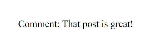
#### Showcase: Comment
Add a string 'Comment' before each comment on a blog.
``` html
That post is great!
```
```css
.comment::before {
content: "Comment: ";
}
```
#### Showcase: Copyright
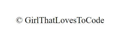
Add a copyright special character before an author of a page.
``` html
GirlThatLovesToCode
```
``` css
.copyright::before {
content: "\00A9";
}
```
### Attribute
You have access to the parent element's (the one you're creating `::before` on) attributes and can use them as the content for the `::before`.
> [Here](https://www.w3schools.com/html/html_attributes.asp) is the list of all possible attributes.
#### Showcase: Show the whole link on hover
``` html
Check this awesome link
```
``` css
#linkOnHover:hover::after {
content: ": " attr(href);
}
```
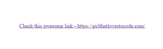
As you can see, you can bind `::after` **just** on `:hover` too!
### Image
You can show an image in your `::before`. This is so useful for styling (eg. lists)!
Because gradients are essentially images, the same rule applies to them.
> The image is inserted at its exact dimensions and can't be resized.
#### Showcase: Ducky
``` html
In software engineering, rubber duck debugging is a method of debugging code. The name is a reference to a story in the book The Pragmatic Programmer in which a programmer would carry around a rubber duck and debug their code by forcing themselves to explain it, line-by-line, to the duck.
You can even use gradient as an image!
Nullam in enim id leo mollis dapibus. Ut eget arcu nunc. Proin in purus accumsan, elementum felis ut, mollis tellus.
[... There is more text on the image]
```
``` css
.gradiented {
position: relative;
width: 500px;
}
.gradiented::before {
content: linear-gradient(to bottom, red, yellow);
position: absolute;
width: 100%;
height: 100%;
z-index: -1;
}
```
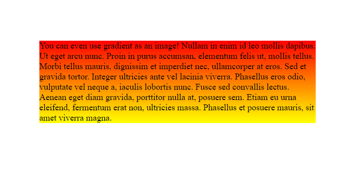
Here is a little more going on than on the rest of the showcases.
Position, width, and height on `::before` are all needed for the gradient to be visible.
If you drop any of those, the gradient won't be visible.
We added a z-index so the gradient doesn't cover the text. It's sent to the background instead.
Because absolute positioned element is positioned regarding the first positioned element, we had to set the position
for its parent element.
### Nothing
You might want to create something with CSS, not just set your content to something (eg. image in the background, so you can resize it).
In that case, you can't just exclude `content` - there is no `::before` without content.
You will want to set the content to an empty string.
> Comment out the properties that you're not sure why they are here. You'll see what changes.
#### Showcase: Image as a background
``` html
I want to have an image on the left side of the text. But my image is too big and I can't resize it if I put it in the content.
```
``` css
.img-bg {
position: relative;
margin: 300px;
width: 400px;
}
.img-bg::before {
content: "";
background-image: url(circle-cropped.png);
position: absolute;
width: 100px;
height: 100px;
background-size: cover;
left: -120px;
top: -30px;
}
```
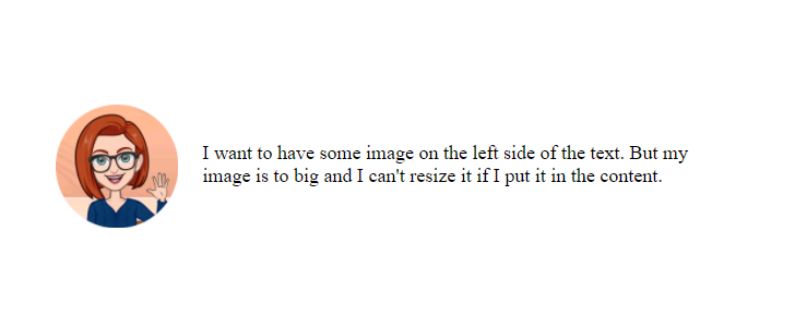
We've set the div's width and height, so it looks better. As in some cases before,
it's `position` is set to `relative` so we can position the `::before` absolutely.
If the content is empty, you need to set `position` as `absolute` if you want the background to be visible.
When working with `background`, you have to set `width`, `height`, and `background-size` for the background to be visible.
`left` and `top` just covers the cosmetics - so the image is where it should be.
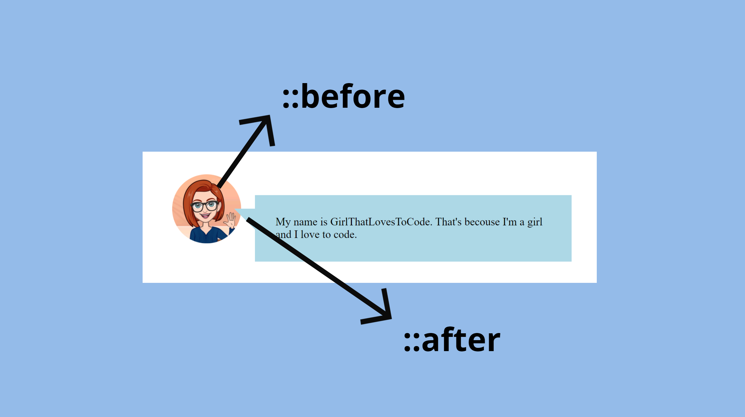
#### Showcase: Speech buble
``` html
My name is GirlThatLovesToCode. That's becouse I'm a girl and I love to code.
```
``` css
.speech{
position: relative;
padding: 30px;
max-width: 500px;
background: #add8e6;
margin: auto;
}
.speech::after {
content: "";
position: absolute;
top: 20px;
left: -30px;
width: 0;
border-width: 30px 30px 0;
border-style: solid;
border-color: #add8e6 transparent;
}
```
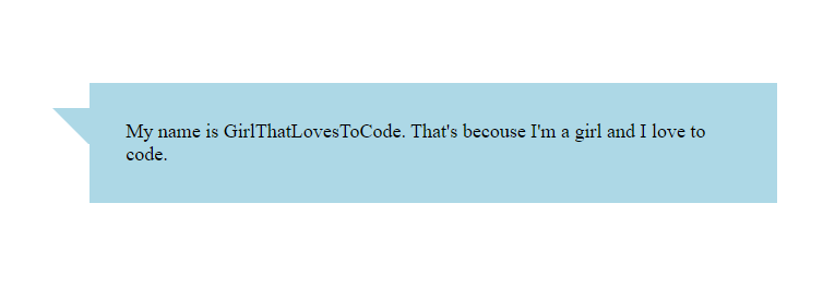
I won't explain the creating of a speech bubble here as that could be a whole new tutorial.
Just notice the `position`s that are set and that `::after` has no content.
The only thing that exists in there, is a border that is shaped into a triangle.
>[Here](https://projects.verou.me/bubbly/) you can create your speech bubbles and play with it.
#### Extra: Combine the before and after
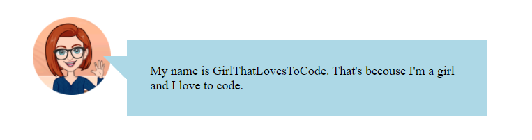
Once you're familiar with the possibilities that `::before` and `::after` offers you,
you can combine them.
If you just add the previously created class `img-bg` you created before, to the `div` with
class `speech`, like this:
```html
My name is GirlThatLovesToCode. That's because I'm a girl and I love to code.
```
and you make no change to the existing CSS, this is what you get:
## Conclusion
Now you should have a better understanding of pseudo-elements `::before` and `::after`.
They are a great way to upgrade your styling, but should never be used for the actual content of your webpage.
The most important part of `::before` is `content`.
Depending on what you're trying to achieve, you select one of the possible values for `content`.
You can style your `::before` with the same CSS rules as you would style any other element.
Keep in mind that the showcases were just examples, used to show the ideas, how you use `::before`
is dependant on your design.