


For a great-looking webpage, all elements need to match the design, including bullets. By default, list styling is very limited:
- While you can change its type, you can't change the color.
- You can select the position of the bullet in two ways (inside/outside), but you don't have any influence regarding pixels.
- You can use an image, but you can't resize or change its position in any way.
If you want to have a lot of freedom at styling it, you have to hide the default list-style and create new 'bullets' with ::before.
What will I learn?
In this tutorial, we will review 5 possibilities of styling bullets:
- Squares
- Triangles
- Icons
- Images
- Bullets that differs
Prerequisites
- basic HTML
- basic CSS
- pseudo-selector
::before
If you don't feel comfortable with
::before, I suggest you check this post explaining it thoroughly.
Intro
All the lists are going to be unordered lists.
There will be five of them, each with a different class ('square-bullets', 'arrow-bullets', 'icon-bullets', 'image-bullets' and 'different-bullets').
Each ul will be created in its own HTML file (named the same as the class of our ul) and each we'll create CSS for it in a separated .css file with the same name.
In all the CSS we'll include a part that sets list-style to none, so the out-of-the-box list styling doesn't interfere with our creations.
Also for all the bullets will set some padding (ul > li {padding: 10px 25px}) so our bullets have a little breathing room.
Squares
Square bullets can be very useful when you want to associate each <li> element with a differently colored area.
You can create squares of different colors (we will see how to that on the last ul).
The interesting thing about square bullets is that they don't have content, they only have a background.
HTML
Let's first create out HTML file:
square.html
<!DOCTYPE html>
<head>
<link rel="stylesheet" href="square.css">
</head>
<body>
<!-- square bullets -->
<ul class="square-bullets">
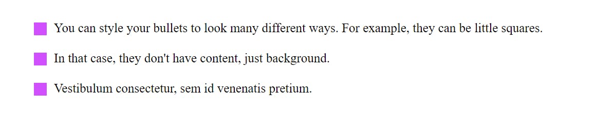
<li>You can style your bullets to look many different ways. For example, they can be little squares.</li>
<li>In that case, they don't have content, just background.</li>
<li>Vestibulum consectetur, sem id venenatis pretium.</li>
</ul>
</body>
</html>
CSS
square.css
ul {
  list-style: none; /* Remove default bullets */
}
ul > li {padding: 10px 25px} /* Stretching li elements a little so it looks prettier */

.square-bullets > li::before {
    content: "";
    width: 16px;
    height: 16px;
    background-color: #d050ff;
    position: absolute;
    top: 12px;
    left: 0;
}
We need to create a ::before selector on the <li> element of our first list with class .square-bullets.
For creating custom bullets, it's important for you to understand
::beforepseudo-element. If you're a little unsure about it, refresh your knowledge before you continue this tutorial.
As I already mentioned, the square bullet doesn't have content.
We select width, height and background-color.
::before is an inline element. That means that we can't assign width and height to it.
Because it doesn't have any content and we can't set width or height to it, its default size is 0 x 0.
We have 2 options to change that:
- Set it as
display: block. That way, we can set its width and height - Set its
positionto absolute. The elements withposition: absoluteare automatically treated asdisplay: block.
I prefer setting the position to absolute because it also gives me the ability to adjust the location of the ::before.
Additionally, for the correct positioning of our absolute-positioned ::before, we need to position its parent element - <li>.
Absolute positioned element is positioned relative to its first positioned (not static) ancestor element (source: w3schools.com).
position: relative doesn't imediatly change elements location, so we are going to use that:
.square-bullets > li {
    position: relative;
}
The square is covering the text and is also not aligned with the text.
We fix that with left and top.
Not sure why we did that? Get acquainted with positioning elements.
Congratulate yourself, you just customized your first ul!
Arrows
HTML
arrow.html
<!DOCTYPE html>
<html lang="en">
<head>
<link rel="stylesheet" href="arrow.css">
</head>
<body>
<ul class="arrow-bullets">
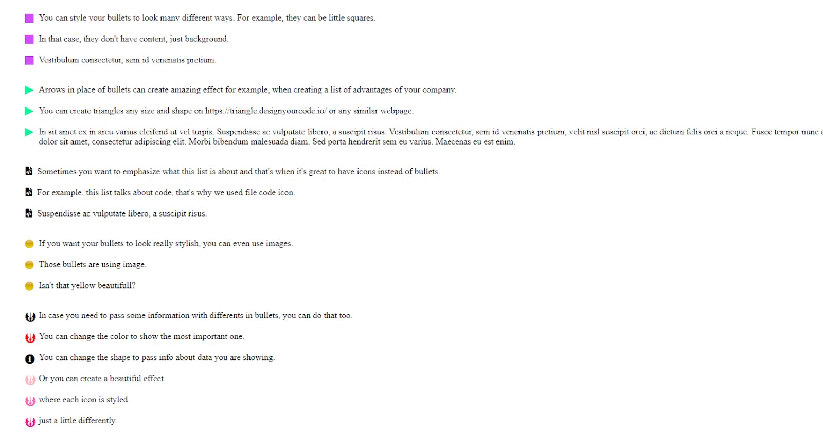
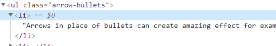
<li>Arrows in place of bullets can create amazing effect for example, when creating a list of advantages of your company.</li>
<li>You can create triangles any size and shape on https://triangle.designyourcode.io/ or any similar webpage.</li>
<li>In sit amet ex in arcu varius eleifend ut vel turpis. Suspendisse ac vulputate libero, a suscipit risus. Vestibulum consectetur, sem id venenatis pretium, velit nisl suscipit orci, ac dictum felis orci a neque. Fusce tempor nunc et nisl accumsan, ac consequat justo elementum. Lorem ipsum dolor sit amet, consectetur adipiscing elit. Morbi bibendum malesuada diam. Sed porta hendrerit sem eu varius. Maecenas eu est enim.
</li>
</ul>
</body>
</html>
Arrow-shaped bullets are great if you want your visitor to focus on the list. As square bullets, arrow bullets also don't have content. However, they are harder to create. Thankfully, we have tools that help us create them.
Go to doodlenerd.com/css-element/css-triangle-gen.. and create a right triangle 16 x 16px.
This is the code that will generate:
.css-triangle {
    width: 0;
    height: 0;
    border-style: solid;
    border-width: 8px 0 8px 16px;
    border-color: transparent transparent transparent #000000;
}
Change the selector to arrow-bullets > li::before
Check the border-color. That's the property that creates the triangle. The first three are transparent, the last one is color.
If you want to change the color of the triangle, you change the last parameter (#000000).
If you check your browser, you will see - nothing.
Inspect the element - you will see the <li> element, but no ::before.
That's because the generator created a triangle that exists as an element, not as a pseudo-element.
All pseudo-elements need to have content, even if it's empty.
And because in this case, it's empty, we need to add position: absolute to a ::before and position: relative to li as in the case with squares.
Because positioning is a little off, we add the same top and left values as before.
This is the css you should have:
arrow.css
ul {
  list-style: none; /* Remove default bullets */
}

ul > li {padding: 10px 25px} /* Stretching li elements a little so it looks prettier */

.arrow-bullets > li {
    position: relative;
}

.arrow-bullets > li::before {
    position: absolute;
    content: "";
    width: 0;
    height: 0;
    border-style: solid;
    border-width: 8px 0 8px 16px;
    border-color: transparent transparent transparent #00fa9a;
    top: 12px;
    left: 0;
}
And this is the result you should see by now:

Icon bullets
Sometimes you want your bullets to communicate something along with the text. That's when you change your bullets to icons (eg. you could use the 'i' icon when you're giving information)
We are going to use Font Awesome icons, so we'll have to include them in our HTML file.
If you want to use your Font Awesome link, follow these instructions.
HTML
icon.html
<!DOCTYPE html>
<head>
    <script src="https://kit.fontawesome.com/d465826c4f.js" crossorigin="anonymous"></script>
    <link rel="stylesheet" href="icon.css">
</head>
<body>

<ul class="icon-bullets">
    <li>Sometimes you want to emphasize what this list is about and that's when it's great to have icons instead of bullets.</li>
    <li>For example, this list talks about code, that's why we used file code icon. </li>
    <li>Suspendisse ac vulputate libero, a suscipit risus.</li>
</ul>
</body>
</html>
I choose 'code' icon, but you can choose something else here.
icon.css
ul {
list-style: none; /* Remove default bullets */
}
ul > li {padding: 10px 25px} /* Stretching li elements a little so it looks prettier */
.icon-bullets > li::before {
font-family: "Font Awesome 5 Free";
font-weight: 900;
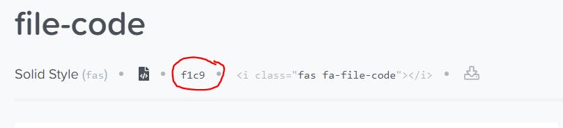
content: "\f1c9";
position: relative;
left: -9px;
}
We have to specify font-family as Font Awesome 5 Free, otherwise browser won't be able to interpret content correctly
and you'll be stuck with little squares.
Font-weight is not necessary, but it causes that solid look. If you let it out, you'll have an outlined icon.
Unicode that you put in content is dependent on the icon you chose, but it always starts with "\f".
You can copy the Unicode of the chosen icon here:
Don't forget the
\at the start of your Unicode or it won't render correctly.
Unlike in previous cases, here we have content, so position: absolute is not necessary, width and height will depend on the content.
However, we used position: relative and left: -9px to give the bullets a little breathing space.
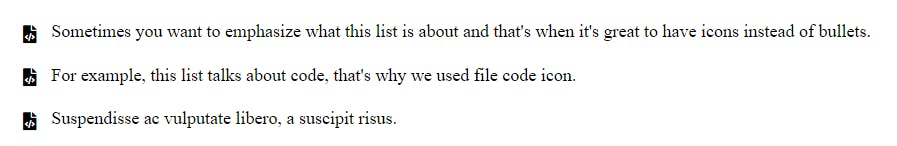
Image bullets
In case you need your bullets to really look the part of your design, you might want to create them as images.
HTML
image.html
<!DOCTYPE html>
<head>
<link rel="stylesheet" href="image.css">
</head>
<body>
<ul class="image-bullets">
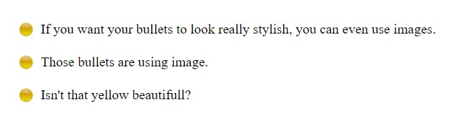
<li>If you want your bullets to look really stylish, you can even use images.</li>
<li>Those bullets are using image.</li>
<li>Isn't that yellow beautifull?</li>
</ul>
</body>
</html>
Here you can download the image I used, but you can use any image you want. Image originates from wpclipart
Image as a content
Inserting an image in a ::before element is fairly simple:
- Inside your project, create a directory, where you're going to put your image and copy the image there (in my case
image/yellowBtn.png). - Refer to your image in
contentwithparameter
This is the whole code:
image.css
ul {
  list-style: none; /* Remove default bullets */
}

ul > li {padding: 10px 25px} /* Stretching li elements a little so it looks prettier */

.image-bullets > li::before {
    content: url(images/yellowBtn.png);
}
Open your browser and check how it looks. Not good? If you try to set height and width, like this:
image.css
.image-bullets > li::before {
    content: url(images/yellowBtn.png);
    height: 10px;
    width: 10px;
}
it won't work. That's because you can't change the dimensions of the image when inserted this way.
You have two ways to solve that problem:
- Either you resize the image with a photo editor or online (unless you have a good reason, I suggest that option)
- Use your image as a background (that's a solution to go with if, for example, you want those images to be of a different size depending on the device size)
You can do basic editing of your images with an online tool like this one
Image as a background
If you for some reason don't want to resize the image, you can set it as a background.
That case is fairly similar to the first one (square bullets).
We set an empty content, the position needs to be absolute and we have to specify width and height.
Because the position is absolute, we also need to set the position of a parent to relative.
We also need to set the background image. We can set it the same way we did before, with url.
image.css
ul {
  list-style: none; /* Remove default bullets */
}

ul > li {padding: 10px 25px} /* Stretching li elements a little so it looks prettier */

.image-bullets > li {
    position: relative;
}

.image-bullets > li::before {
    content: "";
    position: absolute;
    width: 16px;
    height: 16px;
    background-image: url(images/yellowBtn.png);
}
However, this still won't show our bullets.
The magic property that is missing, is background-size.
We are going to set it to contain.
Check all possible
background-sizevalues here.
Currently, bullets are covering part of our sentences, so we fix their position with top and left.
The whole code, that creates our image-bullets, now looks like this:
image.css
ul {
  list-style: none; /* Remove default bullets */
}

ul > li {padding: 10px 25px} /* Stretching li elements a little so it looks prettier */

.image-bullets > li {
    position: relative;
}

.image-bullets > li::before {
    content: "";
    position: absolute;
    width: 16px;
    height: 16px;
    background-image: url(images/yellowBtn.png);
    background-size: contain;
    top: 12px;
    left: 0;
}
And the result is this:
Bullet that differs
You can create a general look of your bullets and then change just a little part of one (or all) bullet. You can do that with all the previous cases, not just with the icons as we are going to do now. You could change any property, eg. color, position, shape, size...
HTML
different.html
<!DOCTYPE html>
<head>
<script src="https://kit.fontawesome.com/d465826c4f.js" crossorigin="anonymous"></script>
<link rel="stylesheet" href="different.css">
</head>
<body>
<ul class="different-bullets">
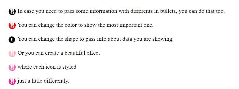
<li>In case you need to pass some information with differents in bullets, you can do that too.</li>
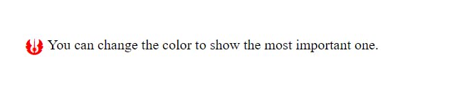
<li class="important-icon">You can change the color to show the most important one.</li>
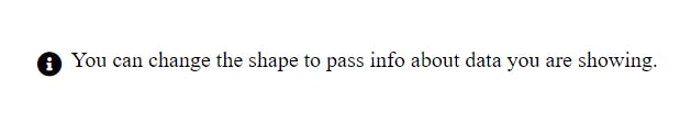
<li class="different-icon">You can change the shape to pass info about data you are showing..</li>
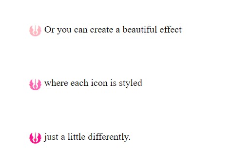
<li id="bColor1">Or you can create a beautiful effect</li>
<li id="bColor2">where each icon is styled</li>
<li id="bColor3"> just a little differently.</li>
</ul>
</body>
</html>
First, we are going to create basic styling, that is the same for all the bullets. CSS for that is almost the same as in icon.css, I only selected different icon and make it a little bigger.
different.css
ul {
  list-style: none; /* Remove default bullets */
}

ul > li {padding: 10px 25px} /* Stretching li elements a little so it looks prettier */

.different-bullets > li {
    position: relative;
}

.different-bullets > li::before {
    font-family: "Font Awesome 5 Free";
    font-weight: 900;
    content: "\f669";
    font-size: 18px;
    position: absolute;
    top: 12px;
    left: 0;
}
Change the color
Maybe you want to emphasize one bullet with red color, so you show its importance.
This is how you make the bullet of li element with class important-icon red:
different.css
.different-bullets > li.important-icon::before {
    color: #ff0000;
}
Change the icon
This is how you change the bullet icon of li element with class different-icon:
different.css
.different-bullets > li.different-icon::before {
    content: "\f05a";
}
Style each icon a little different
Sometimes you want each icon to be a little different,
but want to connect each <li> element to a certain color or create a linear-gradient effect.
Last three <li> elements of <ul class="different-bullets"> each have id.
They all use the same icon, but we want to make each one different shade of pink:
different.css
 #bColor1::before {
    color: #ffb6c1;
 }

 #bColor2::before {
     color: #ff69b4;
 }

 #bColor3::before {
     color: #ff1493;
 }
All those different bullets look like this:
different.css
ul {
    list-style: none; /* Remove default bullets */
}

ul > li {padding: 10px 25px} /* Stretching li elements a little so it looks prettier */

.different-bullets > li {
    position: relative;
}

.different-bullets > li::before {
    font-family: "Font Awesome 5 Free";
    font-weight: 900;
    content: "\f669";
    font-size: 18px;
    position: absolute;
    top: 12px;
    left: 0;
}

.different-bullets > li.important-icon::before {
    color: #ff0000;
}

.different-bullets > li.different-icon::before {
    content: "\f05a";
}

#bColor1::before {
    color: #ffb6c1;
}

#bColor2::before {
    color: #ff69b4;
}

#bColor3::before {
    color: #ff1493;
}
For example, I once connected a floorplan of some building with differently colored areas with a ul so each li had a square bullet colored corresponding with some part of a map.
Possible mistakes
If you're creating your custom bullets and they don't show up, those are the possible reasons:
- Maybe you forgot to set the color of the background (in the case of squares that don't have content)
- You might either forgot to set position absolute or change the
displaytoblock - Check if you turned off default bullets with
ul {list-style: none;} - In the case of using icons, did you write
\before the Unicode of an icon, set the font-family, and import icons font?
Conclusion
In this tutorial, we looked over a few possibilities on how to style bullets, but options are almost limitless. I hope that this tutorial helped you to learn to style beautiful bullets with different colors, images, and icons.
You can check the whole code here